 Doug Davidoff
 Six weeks ago I wrote about the only metric that matters. That metric is the number of people in your addressable market that are paying attention and are engaged with you.
Since I wrote that post I have had a number of conversations on the subject with both clients and business owner friends. The concept has had the same impact on them that it did on me when I first discovered it. There’s quickly a realization that much of the data we’ve learned to rely on as marketers and demand generation executives is often either useless or worse...misleading.
The world of data and analytics has hijacked an engineering term called the signal to noise ratio. In engineering it refers to a measurement that compares the level of a desired signal to the level of background noise. In data and analytics it means being able to separate the data that provides valuable insight from the data that merely creates noise or confusion.
The most common mistake I see when I assess an organization’s marketing and demand generation efforts is that they view a number of metrics - especially at the top and middle of the funnel - as a total, or average number. For example, I’ll often hear or see things like this: traffic is up x percent, we generated y leads, we’ve got z number of leads in our database.
The problem with averages, as the old saying goes, is that if I have one foot in boiling hot water and one foot in ice cold water, if I look at the average I’m fine...and in a lot of pain. And the problem with dashboards that reflect all activity is the data is skewed, often highly, by factors that don’t matter (like anybody not in your addressable market viewing your website).
Think of it this way. You’ve done a great job to build content designed for your desired personas so that it resonates with them, but is of little interest to others, and you’re also reviewing your web analytics. You know that time spent on site and on page is a good indication of engagement so you track that number.
You begin to notice that, as you have developed your new content strategy, Google Analytics is showing that the average time spent on a page or on the site is down. You begin to panic. How can this be? Why are we spending all of this time on our content and site when the data shows we’re getting less engagement? How am I going to explain our investments when I talk with the CEO?
Suddenly you remember that in a typical month only about 23% of the traffic to your site is from your targeted personas. You realize that the time that 77% of your visitors (the ones that you’re optimizing your content not to resonate with) have a greater impact on that metric than the 23% of visitors who actually matter. It is for this reason that you must segment your audience and the dashboards you use to judge and monitor progress.
The Active Funnel
For years I was like every other demand generation executive. I obsessed about leads progressing to marketing qualified leads, sales qualified leads and opportunities. I developed service level agreements (SLAs) to establish targets, protocols and processes for managing this process.
As an advisor, I guided my clients to define their funnel and establish targets for each stage so that the business could predictably meet their growth targets. Then I discovered a nasty little secret. All this work was crap...it wasn’t doing anyone any good. In reality it was causing everybody to aim at the wrong target and miss the reality of their situation.
I discovered this thing called “leakage”, meaning...funnels leak. Many behave more like sieves than like funnels. In addition to the progression of leads, a percentage are going to be disqualified and another chunk are going to become inactive.
I realized that it’s not a question of how many leads we’re managing in our funnel, but how many active leads we’re managing. Don’t get me wrong, I certainly knew that active leads is what mattered from a selling perspective, but the way I was tracking data meant the view from the top of the funnel down was totally out of alignment with how I managed the bottom of the funnel - no wonder sales and marketing alignment is so difficult!
Upon this discovery we quickly implemented a new process. Today, one of the first things we do is define the criteria for what will be considered an “active” lead vs. an “inactive” one. We have one SLA that guides the active funnel and a different one for the inactive funnel.
To effectively monitor how our active funnel is doing, and to quickly and efficiently make decisions about what to do, we’ve designed a dashboard that separates our active funnel from everything else. It allows us to allocate resources effectively, take the proper actions to address problems before they become problems, judge progress and make iterations effectively.
The Active Funnel Dashboard in Action
I’m going to highlight how we use it using this week’s dashboard as an example. As background, we currently have just over 6,000 leads in our database. Of those 6,000, 572 leads representing 387 companies are in our active funnel.
The first thing I want to know is the distribution of leads in our funnel. I want a snapshot of how things look.
A Snapshot of the Funnel
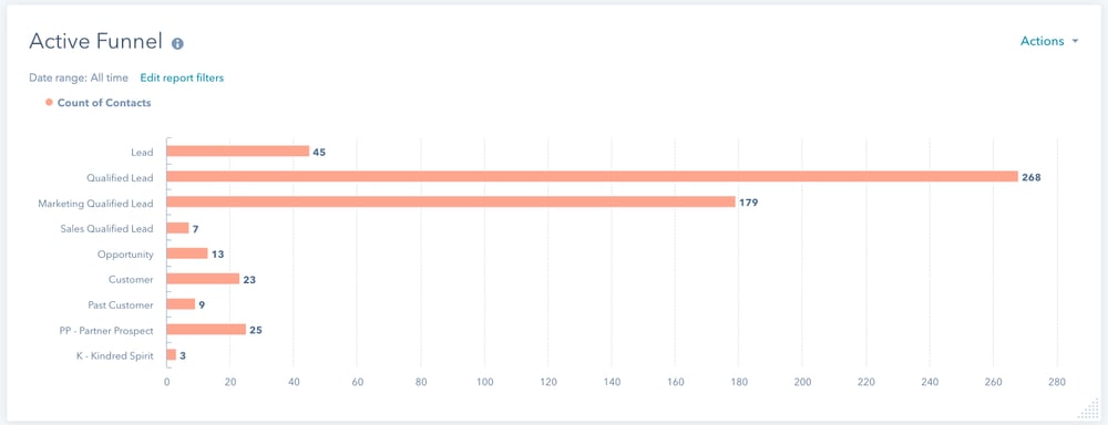
This tells me that I’ve got a strong (for us) top of the funnel. The reality is that we can’t give the proper coverage to all of these leads, so our focus is moving off the top of the funnel to the middle of the funnel, while also working to potentially add some sales capacity so that we can manage more top of funnel opportunities (this is how you know when it’s time to hire on the sales side).
I can also see that there’s an unacceptably high drop off between the top of our funnel and the bottom. Some of this no doubt is caused by our focus earlier this year on strengthening the top (in January we were down to 340 leads at the top) and some recent success we’ve had closing opportunities.
The actions we’re taking from here is increasing the number of tactics designed to start conversations that can lead to sales opportunities.
A Snapshot of Engagement
Our funnel is comprised of contacts and companies that we are pursuing and/or that are actively engaging with our content. Just because we’re pursuing them doesn’t mean they’re engaged with us, so I want to be sure I’m watching that as well. This is one of the primary ways I know if we’re getting the value from our investments in content.
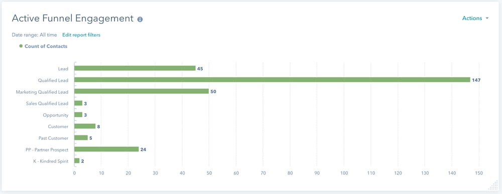
The first thing I notice here is that of the 383 leads that are in our new business funnel, 248 are actively engaged in our content. This is a 65% engagement rate - not bad, but not great. Clearly we need to take some actions to increase our engagement rate.
The next thing I notice is the drop off in content engagement as leads move deeper into our sales process - 55% of our qualified leads are engaged with content, while only 28% of MQLs and below are engaged. After some investigation I’m able to create a hypothesis to the cause (they’re talking to us so they don’t feel the need to read our blogs or visit the site), but our content is designed to support our sales message. You can bet this is a focus for us going forward.
Another item I notice here is that we have very low customer engagement with our content. Upon thinking about this, it’s no surprise. We’ve been focused on strengthening the top of our funnel and customers are working with use so they’re not in research mode (why read the blog when I talk to them every week). However, we realize that this is a big opportunity we’re missing and it has resulted in our initiating a customer engagement initiative.
Funnel Quality
So our funnel is strong from a numbers perspective, but how’s it doing from with quality? Let’s look:
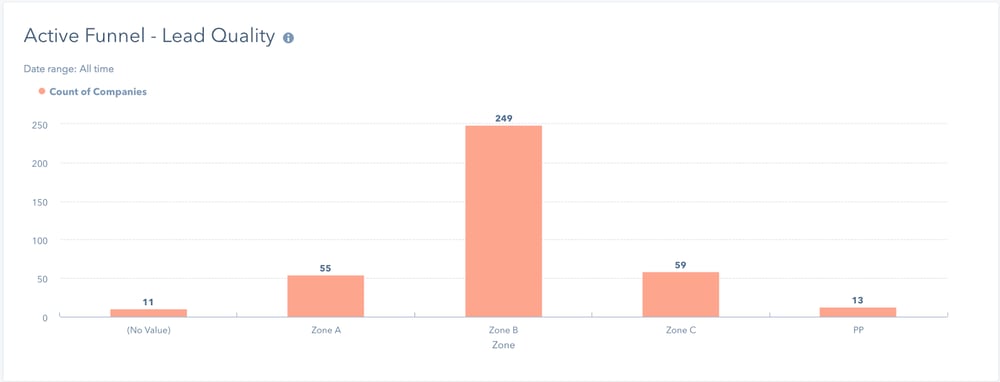
I see that we have 11 leads that have not been rated (this is a result of some of the re-engagement campaigns we’ve initiated, so I make note to tell my sales ops person to ensure we get that updated). I see 84% of our leads are good or great quality, so I’m happy with this. This tells me I should see strong progression of the funnel over the next few weeks and if I don’t, I need to find out what’s happening with our sales development effort or reassess our lead quality rating approach.
Who’s in Our Funnel
As a company that addresses the full funnel, I like to have a good balance of personas in our funnel. I also want to make sure that we’re addressing multiple personas from a selling perspective.
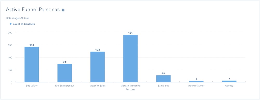
I see here that we’ve got a growing number of leads that have not been categorized from a persona perspective (note to sales ops, let’s get this caught up) and from a balance perspective we’re doing okay. I’d like us to have a higher percentage of our Victor persona, so we’ll probably create a more content focused there over the next couple of months.
Where Are My Best Leads Coming From
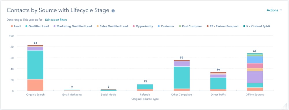
With this, I’m able to see the source of the leads in my active funnel and where they are in the funnel. Given our recent plans and initiatives, I quickly see that the distribution of lead sources is in alignment with our efforts. I do notice that while Organic, Other and Direct are producing qualified leads, it’s offline sources that are producing down funnel leads.
This is actually no surprise as it’s primarily the result of our outreach to inbound leads. It’s not at all uncommon that the person who first gets into our database is not the person that we ultimately want to focus on. By reaching out to the initial lead, we are able to get things started and get connected to the right person. With that consideration I conclude I’m comfortable with the distribution of lead sources.
The entire process typically takes me about 10 - 15 minutes and with that, I’m clear on where we are and what we need to be doing.