 At the beginning of every month at Imagine Business Development, we review our clients and our own inbound marketing stats for the previous month. We review number of visits, leads, overall conversion rate, landing page conversion rate, blog visits, most popular blog posts, etc.
Part of the review process includes identifying what things appear to be working as well as what areas need to improve. For one of our newer clients, the total number of visits to landing pages was surprisingly low. We recently completed phase one of their site redesign using a growth driven design approach. There are still areas we are developing. So one could argue that the number is low simply because of the process we are currently executing. However, the calls to action or CTAs that are supposed to attract visitors to the landing pages are also a suspect.
At Imagine, we are all inbound-certified and have learned the best practices to use when creating CTAs. So while we always apply what we know, sometimes there are a few tweaks or a different approach that will work better with certain buyer personas. The CTAs we created initially were not done wrong, they just may not be right for this particular audience.
Only time will tell if new CTAs make a difference. I’ll let you know in a future post. For now, here are 6 things I’m keeping in mind as I create a second version of those CTAs.
1. Use action words
Remember elementary school language arts classes? We all learned about action verbs as opposed to passive verbs. CTAs are a place to use your action verbs. Tell your personas exactly what you want them to do and make it sound exciting. Try words like Download, Learn, Reserve, Call or Discover.
2. Be very clear
Many visitors are reluctant to click on an offer especially if they are discovering your site and organization for the first time. It is important to be very clear and concise in your CTAs. It’s not enough to tell them to download your ebook, whitepaper or checklist. They need to know exactly how that content will benefit them.
This Imagine CTA for our guide, How to Effectively Manage Inbound Leads is one of our top performing CTAs.

The CTA explains exactly what the prospect will receive (without providing too much information), if they click on Download Now. We have eliminated the risk and have hopefully taken the first step toward developing trust.
3. Don’t make them search
Unless your CTA is part of a scavenger hunt, don’t hide it! Make it big enough to get noticed every time a prospect visits the page. A tiny CTA at the bottom of a page has very little chance of converting anyone. Make your CTAs big and don’t hide them. If the page design allows, keep them above the fold.
4. Design to convert
When designing your CTAs, it is important that the reader can clearly see where to click to get your offer. Keeping your branding guidelines in mind, use contrasting colors to make the actual button almost pop off the page. Other things to try include different shaped buttons or shadows and outlines to make the buttons look more like actual buttons.
In this CTA for an Imagine ebook, we used the bright gold from our color palette, rounded edges and a shadow to set the button apart. Our prospects know exactly where to click to get the ebook.

5. Create some urgency
Creating urgency is sometimes enough to spur someone to click on your CTA. Adding “today only” or “for a limited time” to your text can create not only a sense of urgency but also a sense of scarcity. Adding the word “now” like we did in our ebook CTA above is another simple way to get a visitor to click sooner than later.
6. Have multiple CTAs for the same offer
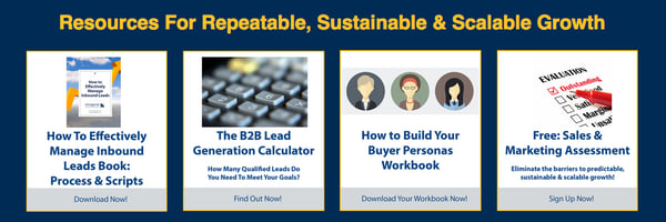
At Imagine, we create multiple versions of every CTA. We have horizontal, vertical and square versions for most of our premium content offers. On our homepage, we include these CTAs in this format.

Every blog post includes a CTA at the end of the text. Those CTAs look like the two I included above. For email nurturing campaigns, we may create another version. The point is that alternate formats may perform better in certain situations. Don’t limit yourself.
Every organization’s buyer personas are unique. Sometimes one company may have multiple personas that are vastly different. There is no way to know for sure how that audience will respond to your CTAs. The best things you can do is apply the best practices and then measure your results. One of the greatest things about inbound marketing is the ability to evaluate and adjust. Tweaking your CTAs may seem like a bother but sometimes one small change can make a huge impact on conversion.

